http://gizmodo.com/5403584/mpaa-shuts-down-entire-towns-wi+fi-over-single-illegal-download
Few would argue that the interface of downloading files is problematic for the entertainment industry. However, such a consensus is destroyed when it comes to actually solving the issue of internet piracy. The Motion Picture Association of America and the Recording Industry Association of America have been identified by downloaders as enemies of their righteous cause. Now, I'll admit that I download a lot, but never have I argued that what I've done is right.
On the other hand, many actions taken to combat piracy have resulted in First Amendment arguments and uproar among the Internet community. One such case occurred this week, when the MPAA sent a violation of copyright notice to an Internet Service Provider in the city of Coshocton, Ohio. Although the violation was simply one download, the ISP responded by shutting down the Wi-Fi network of the entire city, used by up to 100 people a day. As the town faced legal battle, they simply complied and shut the network down.
I understand that companies are frustrated by profits lost from downloading, and moreso in this economic climate. However, intimidation and collective punishment is the wrong way to go. Unfortunately I have no idea how anyone can solve this issue. Several options have been proposed, but all have extreme problems:
-"Digital Rights Management" was intended to prevent users from ripping or transferring their CDs to other computers, but many DRM programs created viruses on the user's computer. This technology doesn't punish sharing of music, the actual illegal act, but rather just having music one purchased on their own computer.
-"Bandwidth throttling" is a solution proposed by some artists and companies. This would result in servers being limited in the amount of data they accept and transmit over a certain period of time. Of course, Internet speculators are against this method as they predict it would result in paying more for access to more data and sources. This is a worst-case-scenario, but regardless it is flawed.
-Targeting individuals as an example. This solution has undergone the most scrutiny of all. Record labels and movie studios have sued individual downloaders for millions of dollars, often thousands upon thousands per song, in an attempt to intimidate the general public. By making an example of these people, the companies have simply incited anger amongst those who download and personal issues for those that were sued.
Thanks to the Electronic Frontier Foundation for proposing a new option:
http://www.eff.org/wp/better-way-forward-voluntary-collective-licensing-music-file-sharing
Voluntary collective licensing would mean that users could pay a $5-10/month fee to continue filesharing, with that money going straight to artists and copyright holders as it should. The EFF states that the more people share, the more money would go to the artists and copyright holders. Problem solved, right?
Not necessarily. Getting people to agree to this fee would mean dramatically enforcing the legal consequences for those who tried to share without paying the fee, leading us full circle to the consumer backlash.
No wonder why everyone's got headaches over this issue. The interface of filesharing has opened up an enormous can of worms that won't be resolved any time soon. Never has sharing been so convenient or fast, and since these problems weren't thought out beforehand, the issue will continue to get worse long before it improves.
Sunday, November 15, 2009

Learning Log IX: Designing Services
In light of our latest project, the redesign of the 11th and 12th floors in Terra, Dan Saffer's passage about "Service Design" in DFI has much to reveal. In a way this reading connects our field work with that of the digital realm and also to the work of more prominent designers. The same problems we had to look out for - low affordances, contrasting visuals, lack of information - are issues that continue to plague both the digital world and modern real-world services. The author diagrams several services moment by moment and uses this process to identify issues that we can fix. In this reading it's revealed that designing for interaction, especially with services in mind, is far more troubling than we'd expect.
The reading both intimidated me and brought out a greater appreciation for interface designers. As a graphic design major, we worry about much smaller and specialized aspects of design, focusing entirely on visuals. What font we use, the color of an element, the placement of a picture or the structure of an image are some of the things we're concerned with. Meanwhile, interface designers have to worry about individual moments in time and how a user reacts to any element, whether it be the type of button or the simple order of events.
The process of service design (and the service string in particular) can be likened to storyboarding for a film, but in this case the consequences are far more severe. Saffer even mentions storyboarding in the passage. For a director, the goal is to set up the structure of the movie and place all aspects in their right location for ideal storytelling and artistic effect. In contrast, service designers are setting up the structure of an event, something that a user may pay for or have to live with every day of their life.
This process reminds me that many designers aren't spending enough time on their service designs, focusing on technology or aesthetic more than functionality. As generic of a statement as this may be, our interfaces would work far better and serve our interests more if companies spent more time on the prototyping aspect of their product creation. Saffer states that sometimes low cost solutions can greatly improve a service, as with the example of water bottles on an airplane, so why aren't there more simple, convenient solutions to design errors? Why do some of these errors even get past their creators?
The reading both intimidated me and brought out a greater appreciation for interface designers. As a graphic design major, we worry about much smaller and specialized aspects of design, focusing entirely on visuals. What font we use, the color of an element, the placement of a picture or the structure of an image are some of the things we're concerned with. Meanwhile, interface designers have to worry about individual moments in time and how a user reacts to any element, whether it be the type of button or the simple order of events.
The process of service design (and the service string in particular) can be likened to storyboarding for a film, but in this case the consequences are far more severe. Saffer even mentions storyboarding in the passage. For a director, the goal is to set up the structure of the movie and place all aspects in their right location for ideal storytelling and artistic effect. In contrast, service designers are setting up the structure of an event, something that a user may pay for or have to live with every day of their life.
This process reminds me that many designers aren't spending enough time on their service designs, focusing on technology or aesthetic more than functionality. As generic of a statement as this may be, our interfaces would work far better and serve our interests more if companies spent more time on the prototyping aspect of their product creation. Saffer states that sometimes low cost solutions can greatly improve a service, as with the example of water bottles on an airplane, so why aren't there more simple, convenient solutions to design errors? Why do some of these errors even get past their creators?
Monday, October 26, 2009
Show and Tell: The Horror, The Horror
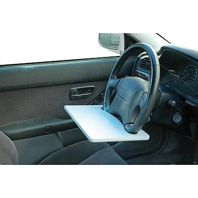
I found this puzzling device on Jalopnik.com, along with some parodies of its inevitable use with laptops: The Laptop Steering Wheel Desk, new from Mobile Office, allows the user to attach the device to his or her steering wheel. The company intends its use for writing a note or snacking on some lunch in your car, but it can also accommodate a laptop. The product description covers the company's hide, of course, by stating: "For safety reasons, never use this product while driving."
I feel like this device is troublesome at best and disposable at worst. Sure, people want to conveniently eat while driving or perhaps jot down an idea or two that they have, but driving has become less and less of a focused activity. With cell phones, stereos, screens, and other gadgets to distract our attention, why even give the option of a desk? It's hard enough to focus on driving when you want to eat, let alone if you're using a computer! Mobile Office may have given a warning, but people who would spend $25 to purchase this are the same people who would consider multitasking so irresponsibly while driving.
Constraints would serve this interface well. If the size was perhaps smaller, not fit to allow the weight or length of a laptop, then perhaps people would be encouraged to use it in the intended manner. Regardless, a puzzling idea.
 Sources:
http://jalopnik.com/5390061/amazon-users-hack-steering-wheel-laptop-desk-page-show-outcome-of-use?skyline=true&s=x
http://www.amazon.com/gp/product/B000IZGIA8?ie=UTF8&tag=random-good-stuff-20&linkCode=as2&camp=1789&creative=390957&creativeASIN=B000IZGIA8
 The Laptop Steering Wheel Desk, new from Mobile Office, allows the user to attach the device to his or her steering wheel. The company intends its use for writing a note or snacking on some lunch in your car, but it can also accommodate a laptop. The product description covers the company's hide, of course, by stating: "For safety reasons, never use this product while driving."
I feel like this device is troublesome at best and disposable at worst. Sure, people want to conveniently eat while driving or perhaps jot down an idea or two that they have, but driving has become less and less of a focused activity. With cell phones, stereos, screens, and other gadgets to distract our attention, why even give the option of a desk? It's hard enough to focus on driving when you want to eat, let alone if you're using a computer! Mobile Office may have given a warning, but people who would spend $25 to purchase this are the same people who would consider multitasking so irresponsibly while driving.
Constraints would serve this interface well. If the size was perhaps smaller, not fit to allow the weight or length of a laptop, then perhaps people would be encouraged to use it in the intended manner. Regardless, a puzzling idea.
 Sources:
http://jalopnik.com/5390061/amazon-users-hack-steering-wheel-laptop-desk-page-show-outcome-of-use?skyline=true&s=x
http://www.amazon.com/gp/product/B000IZGIA8?ie=UTF8&tag=random-good-stuff-20&linkCode=as2&camp=1789&creative=390957&creativeASIN=B000IZGIA8
Saturday, October 10, 2009
Project 1: Redesigning a Website

(it only gets worse)
Although Carlino Guitars’ instrument and supply selection is admirable, their website leaves much to be desired. In fact, it violates several design “commandments” established by both Don Norman and Steve Krug. When faced with their homepage, an overwhelming amount of text and pictures is present. In the terms of Krug, we can refer to this as “noise”. For example, what’s the purpose of repeating the Dean Guitars logo multiple times on the same product page, then having DEAN in vertically arranged letters on the right side of the guitars?

(distracting and unfocused)
If we go by Krug’s fact of life #1, then it is true that “we don’t read pages. We scan them” (Krug 22). Carlino’s website is of no assistance to scanning users, as all of the information on the homepage is contained in a disjointed format with no logical order. Also, most of this information is not immediately visible, bypassing one of Norman’s principles: to “make things visible” (Norman 13). If the user needs to scroll down the homepage to read something, it shouldn't be of clear importance. Carlino has key information such as the store's location and hours relegated to the bottom of the page, past tons of text and pictures.

(where is the order or reason to these text blocks?)
Various elements are either incomplete or utterly broken. For instance, clicking the Carlino Guitars logo takes the user to the image file of that logo, rather than bringing he or she to the homepage. The use of two toolbars is completely unnecessary, especially with the vertical toolbar on the left side of the site. Why list by brand and not by category? Constraints can often be a good thing, but in this case it’s far easier to click “guitars” and view the site’s complete selection then limit the user so much that they must know what brand they want before shopping.

(a breath of fresh air...organized and readable!)
Despite its imperfections, the instrument conglomerate Musician’s Friend has done a lot of things right with its website. For one, the site uses one simple and easy to read toolbar that presents the user with product categories. If they want to look at guitars, they simply hover over guitars and further subdivisions are displayed. In keeping with Krug’s idea to design great billboards, the toolbar is at the very top of the screen. As this toolbar is the most convenient and furthest-reaching form of navigation, the top location is logical.

(the price, picture, and name of the products are visible without distraction)
If the user is looking for a specific brand, they can search for the brand in a search bar presented to the left or sort through the brand after clicking on the product category. Perhaps the most important feature of the Musician’s Friend website is its grouping. Unlike Carlino’s confusing and cluttered layout, every category is separated into its own defined space. For example, on the homepage it is clear that the user can look at price cuts on the right side, or services and specials below it on the bottom right. Throughout the site, the same heading is used for convenient navigation.

My design mixes the user-friendliness and organization principles of the Musician’s Friend site with Carlino’s more simplistic option range. As a localized instrument dealer, Carlino Guitars doesn’t have the need to provide user reviews or “gold coverage” programs, allowing the pages to be even cleaner and easier to read than Musician’s Friend.

I eliminated the problem of feedback by utilizing a color system for buttons and clickable objects. Any clickable button is turned red when highlighted. Any highlighted text on menus is turned bold, as the menu you are currently on is also highlighted red (see homepage screenshot).

Monday, September 28, 2009
Learning Log VIII: Blu-Ray and "Doing Things Right"
While reading chapter 6 of Norman's DOET, "The Design Challenge", a thought popped into my head. Norman rightfully complains that too many computer programs make it impossible for you to forget about the computer and focus straight on the problem (Norman 179). The Blu-Ray DVD technology has taken this common issue and transferred it to movie-watching. Most people who buy a disc to watch their favorite flick just want to watch the movie, but often are encumbered by menu after menu before they can enjoy the film they bought. Blu-Ray DVDs simply start the film, with the menu button on a remote summoning a nice pop-under menu for those who wish to select a scene, watch extras, or change options:
 (a screen capture of The Dark Knight on Blu-Ray, courtesy of gizmodo.com)
 (a screen capture of The Dark Knight on Blu-Ray, courtesy of gizmodo.com)
Of course, most people don't have Blu-Ray players (myself included). The extra cost is frustrating, especially if a household doesn't own an HDTV required to play these discs. Video gamers could purchase a Playstation 3, currently one of the best and cheapest Blu-Ray players, but what about those of us who already spent 400-or-so dollars on a video game console? This directly relates to another one of Norman's points.
In the section entitled "Forces that Work Against Evolutionary Design", Norman mentions a particularly disturbing aspect of modern design and consumerism. When a product is released with the seemingly flawless blend of features, great design, and usability, that cannot become a standard. Due to copyrights, patents, and business competition, every company is limited to releasing their own fairly unique products (143). This prevents effective ideas from becoming standard. For instance, people should have more of a choice in music players than the iPod or Zune, but Apple and Microsoft have taken hold of so many ideas that all competing products are notably inferior.
Let's jump back to Blu-Ray. Microsoft released an HD DVD player for their Xbox 360 video game console that served as the first application of high-definition movies for such a system. HD DVD is a discontinued format created by Toshiba. Sony followed suit with the Playstation 3, containing their own aforementioned Blu-Ray technology. Seeing as Toshiba's HD DVD was less popular and required a proprietary player to use for the 360, it lost the "format war" against Sony's Blu-Ray. Why won't Microsoft and Sony work on enabling Blu-Ray access for the Xbox 360? Why was there a war in the first place? An answer to the former question can be read below:
http://xbox360.ign.com/articles/943/943425p1.html
Like Norman mentions, this executive thinks he knows what users want, as a result of the designer shut out caused by "corporate bureaucracy" (158). Consumers should be allowed to have a choice. Some of us have no need for a PS3 but would love to watch HD movies. I, for one, purchased an HDTV just for my Xbox 360, so why not let me use it for other things as well?
"These people believe they know what customers want and feedback from the real world is limited by filters they impose." - anonymous designer (158)
In the section entitled "Forces that Work Against Evolutionary Design", Norman mentions a particularly disturbing aspect of modern design and consumerism. When a product is released with the seemingly flawless blend of features, great design, and usability, that cannot become a standard. Due to copyrights, patents, and business competition, every company is limited to releasing their own fairly unique products (143). This prevents effective ideas from becoming standard. For instance, people should have more of a choice in music players than the iPod or Zune, but Apple and Microsoft have taken hold of so many ideas that all competing products are notably inferior.
Let's jump back to Blu-Ray. Microsoft released an HD DVD player for their Xbox 360 video game console that served as the first application of high-definition movies for such a system. HD DVD is a discontinued format created by Toshiba. Sony followed suit with the Playstation 3, containing their own aforementioned Blu-Ray technology. Seeing as Toshiba's HD DVD was less popular and required a proprietary player to use for the 360, it lost the "format war" against Sony's Blu-Ray. Why won't Microsoft and Sony work on enabling Blu-Ray access for the Xbox 360? Why was there a war in the first place? An answer to the former question can be read below:
http://xbox360.ign.com/articles/943/943425p1.html
Like Norman mentions, this executive thinks he knows what users want, as a result of the designer shut out caused by "corporate bureaucracy" (158). Consumers should be allowed to have a choice. Some of us have no need for a PS3 but would love to watch HD movies. I, for one, purchased an HDTV just for my Xbox 360, so why not let me use it for other things as well?
"These people believe they know what customers want and feedback from the real world is limited by filters they impose." - anonymous designer (158)
Sunday, September 27, 2009
Learning Log VII: Unreliable Memory
The parallels between chapter 5 of Don Norman’s The Design of Everyday Things, and material we covered in class last week are fascinating. In chapter 5, Norman discusses the aspects of human memory and how designers must cater to the nuances of the mind. We may not remember the littlest things, but our brains also have the power to retain incredible pieces of data. He believes that memory is like a filing cabinet and thus cross-referential (Norman 115). In 1988 this was a relatively new theory about how we store our memories, but it makes plenty of sense, as this explains how we use prior experiences to make new decisions even with a change in context.
The WNYC talk show Radiolab, however, is recorded in the 21st century and can provide us with a new perspective. As the hosts discussed, memory is a very general thing and can be modified over time by idealizations created by the human mind. Norman even touches on this a bit in a section entitled The Connectionist Approach, stating that our memories are a result of “compromise” (117).
With this knowledge I’ve come to a personal conclusion that memory is a powerful yet ultimately unreliable facet of the human condition. Designers should never rely on one’s memory, unless there is a strict standard on what people are expected to memorize. For instance, nearly everyone knows their phone number(s), but how many people can remember what they ate last Tuesday? It’s unlikely that the latter would be used in a case like this, but the comparison goes to show that memories are both vast and temporary, often disintegrating into a general feeling more so than specific points of information.
The WNYC talk show Radiolab, however, is recorded in the 21st century and can provide us with a new perspective. As the hosts discussed, memory is a very general thing and can be modified over time by idealizations created by the human mind. Norman even touches on this a bit in a section entitled The Connectionist Approach, stating that our memories are a result of “compromise” (117).
With this knowledge I’ve come to a personal conclusion that memory is a powerful yet ultimately unreliable facet of the human condition. Designers should never rely on one’s memory, unless there is a strict standard on what people are expected to memorize. For instance, nearly everyone knows their phone number(s), but how many people can remember what they ate last Tuesday? It’s unlikely that the latter would be used in a case like this, but the comparison goes to show that memories are both vast and temporary, often disintegrating into a general feeling more so than specific points of information.
Sunday, September 20, 2009
Learning Log V: Talkin' Biometrics
In chapter 3 of Don Norman’s The Design of Everyday Things, the author discusses a supposed “conspiracy against memory” and how the use of knowledge in the head can become overwhelming as we are presented with more and more things to remember each day (Norman 63). Norman lists the codes and numbers he is expected to retain in his daily encounters, and I must agree with him on the troubles generated by this culture. He goes on to cite the importance of reminders in keeping oneself connected to the outer world (72). As knowledge is in both the head and the world, connecting the two is quite helpful.
These observations, made in a book published in 1988, bring to mind a frustrating aspect of modern interface design: how are we expected to remember everything? The problem lies in more than just passwords and numerical codes but computer commands, parameters, and other quirks. The fact that no one has managed to standardize any of these systems in the past 20 years is quite puzzling. There ought to be a way to unify your social security, credit cards, etc. without security issues. At the very least, why aren’t computer commands unified? Apple-G or what have you may do something completely different in one program than another. As I type this in Microsoft Word, I realize that to close a document you must remember to press Apple-W rather than the fairly standardized Apple-Q. Why are these deviations accepted?
A piece of fiction may have unintentionally shown the way. The fantastic movie Gattaca (1997) portrays a society where your fingerprints and individual characteristics allow access to nearly everything you would attain with a code or card. Of course, the film’s world limits access to this new society to a process of eugenics, a rather grim outlook on the future, but the idea is fascinating. I mean, if they use biometrics at Disney World to check your ticket, then why not in other aspects of life?
 (screenshot of fingerprint-processing device from Gattaca)
Surely time will tell if this process becomes the norm.
These observations, made in a book published in 1988, bring to mind a frustrating aspect of modern interface design: how are we expected to remember everything? The problem lies in more than just passwords and numerical codes but computer commands, parameters, and other quirks. The fact that no one has managed to standardize any of these systems in the past 20 years is quite puzzling. There ought to be a way to unify your social security, credit cards, etc. without security issues. At the very least, why aren’t computer commands unified? Apple-G or what have you may do something completely different in one program than another. As I type this in Microsoft Word, I realize that to close a document you must remember to press Apple-W rather than the fairly standardized Apple-Q. Why are these deviations accepted?
A piece of fiction may have unintentionally shown the way. The fantastic movie Gattaca (1997) portrays a society where your fingerprints and individual characteristics allow access to nearly everything you would attain with a code or card. Of course, the film’s world limits access to this new society to a process of eugenics, a rather grim outlook on the future, but the idea is fascinating. I mean, if they use biometrics at Disney World to check your ticket, then why not in other aspects of life?
 (screenshot of fingerprint-processing device from Gattaca)
Surely time will tell if this process becomes the norm.
Subscribe to:
Posts (Atom)
