(it only gets worse)
Although Carlino Guitars’ instrument and supply selection is admirable, their website leaves much to be desired. In fact, it violates several design “commandments” established by both Don Norman and Steve Krug. When faced with their homepage, an overwhelming amount of text and pictures is present. In the terms of Krug, we can refer to this as “noise”. For example, what’s the purpose of repeating the Dean Guitars logo multiple times on the same product page, then having DEAN in vertically arranged letters on the right side of the guitars?

(distracting and unfocused)
If we go by Krug’s fact of life #1, then it is true that “we don’t read pages. We scan them” (Krug 22). Carlino’s website is of no assistance to scanning users, as all of the information on the homepage is contained in a disjointed format with no logical order. Also, most of this information is not immediately visible, bypassing one of Norman’s principles: to “make things visible” (Norman 13). If the user needs to scroll down the homepage to read something, it shouldn't be of clear importance. Carlino has key information such as the store's location and hours relegated to the bottom of the page, past tons of text and pictures.

(where is the order or reason to these text blocks?)
Various elements are either incomplete or utterly broken. For instance, clicking the Carlino Guitars logo takes the user to the image file of that logo, rather than bringing he or she to the homepage. The use of two toolbars is completely unnecessary, especially with the vertical toolbar on the left side of the site. Why list by brand and not by category? Constraints can often be a good thing, but in this case it’s far easier to click “guitars” and view the site’s complete selection then limit the user so much that they must know what brand they want before shopping.

(a breath of fresh air...organized and readable!)
Despite its imperfections, the instrument conglomerate Musician’s Friend has done a lot of things right with its website. For one, the site uses one simple and easy to read toolbar that presents the user with product categories. If they want to look at guitars, they simply hover over guitars and further subdivisions are displayed. In keeping with Krug’s idea to design great billboards, the toolbar is at the very top of the screen. As this toolbar is the most convenient and furthest-reaching form of navigation, the top location is logical.

(the price, picture, and name of the products are visible without distraction)
If the user is looking for a specific brand, they can search for the brand in a search bar presented to the left or sort through the brand after clicking on the product category. Perhaps the most important feature of the Musician’s Friend website is its grouping. Unlike Carlino’s confusing and cluttered layout, every category is separated into its own defined space. For example, on the homepage it is clear that the user can look at price cuts on the right side, or services and specials below it on the bottom right. Throughout the site, the same heading is used for convenient navigation.

My design mixes the user-friendliness and organization principles of the Musician’s Friend site with Carlino’s more simplistic option range. As a localized instrument dealer, Carlino Guitars doesn’t have the need to provide user reviews or “gold coverage” programs, allowing the pages to be even cleaner and easier to read than Musician’s Friend.

I eliminated the problem of feedback by utilizing a color system for buttons and clickable objects. Any clickable button is turned red when highlighted. Any highlighted text on menus is turned bold, as the menu you are currently on is also highlighted red (see homepage screenshot).

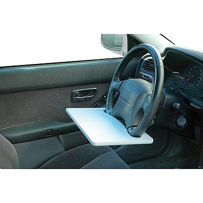
 The Laptop Steering Wheel Desk, new from Mobile Office, allows the user to attach the device to his or her steering wheel. The company intends its use for writing a note or snacking on some lunch in your car, but it can also accommodate a laptop. The product description covers the company's hide, of course, by stating: "For safety reasons, never use this product while driving."
 Sources:


